As someone who ran a gym for almost a decade and made the exact mistakes I’m going to list out below, I am uniquely qualified to tell you exactly how not to market your gym business. Between using my business social media accounts as a platform to wax poetic about strength training and spending hundreds, if not thousands, of dollars on poorly crafted Facebook ads, I’ve run the gamut of bad marketing schemes. I chased the shiny object instead of focusing on the important touch-points and found myself at the end of every month wondering why I wasn’t getting more leads.
Your two most valuable pieces of marketing real estate are your website and your social media pages. Not your flyers or the A-frame on the sidewalk, and definitely not the banner you paid a guy $400 to hang on the fence.
Here's the test both of them have to pass. When I land on your page or your post, can you tell me three things within about 15 seconds?
If you can't, you have a big problem. Fifteen seconds isn't me being dramatic, either. There are a lot of dorky marketing researchers who have studied this. If you don’t believe me, think about how you view someone's page or profile: you scan it quickly to see if there’s something that catches your eye. If you aren’t grabbed by something, you move on. You don't get a minute, and you don't get a scroll. You get a glance.
Now, let's talk about where most gyms are blowing that glance.
Your Website
Your gym is not a SaaS platform
I say this with love, as someone who literally works for a SaaS company: your gym does not need a website that breaks down every “feature” you offer in painstaking detail.
I can't tell you how many gym websites I've visited before a demo where I still couldn't figure out who the gym serves or what it offers them. And I'm doing this on purpose, for my job, with every reason to pay attention. Imagine how fast a tired parent scrolling on their phone at 9:45 p.m. is giving up.
What usually happens is this: there's a hero image of a barbell, a tagline like "Forge Your Strongest Self," and below that sit six programs, a mission statement, a founder bio, a schedule PDF, a photo gallery from a 2019 Murph, and a "Contact Us" form that drops into a void.
None of that answers the three questions.
It's not (just) about aesthetics
To be clear, I'm not mostly talking about looks. Although, boys and girls, between you and me, we need to work on that too. The low-res logo and wall of text describing your “gym owner journey” aren't doing you any favors.
But aesthetics only matter as far as they cleanly deliver the three things above. A gorgeous site that doesn't tell me who you serve is just an expensive way to confuse me. A plain site that says "Strength coaching for adults 40+ who've never touched a barbell. Book a free intro." will beat it every single time.
So here's what actually matters.
1. Above the fold is the whole ballgame
"Above the fold" is whatever someone sees before they scroll. On a phone, which is how most of your prospects are finding you, that's not much space. It's also where people spend the majority of their attention. Again, some people in white lab coats who study consumer behaviors could inundate you with stats on this.
So that first screen has one job: answer the three questions. That means:
- A headline that says what you do and who it's for. "Small-group strength training for busy parents in [Your Town]" works. "Unleash Your Potential" doesn't. That headline could be a gym, a life coach, or a pre-workout brand.
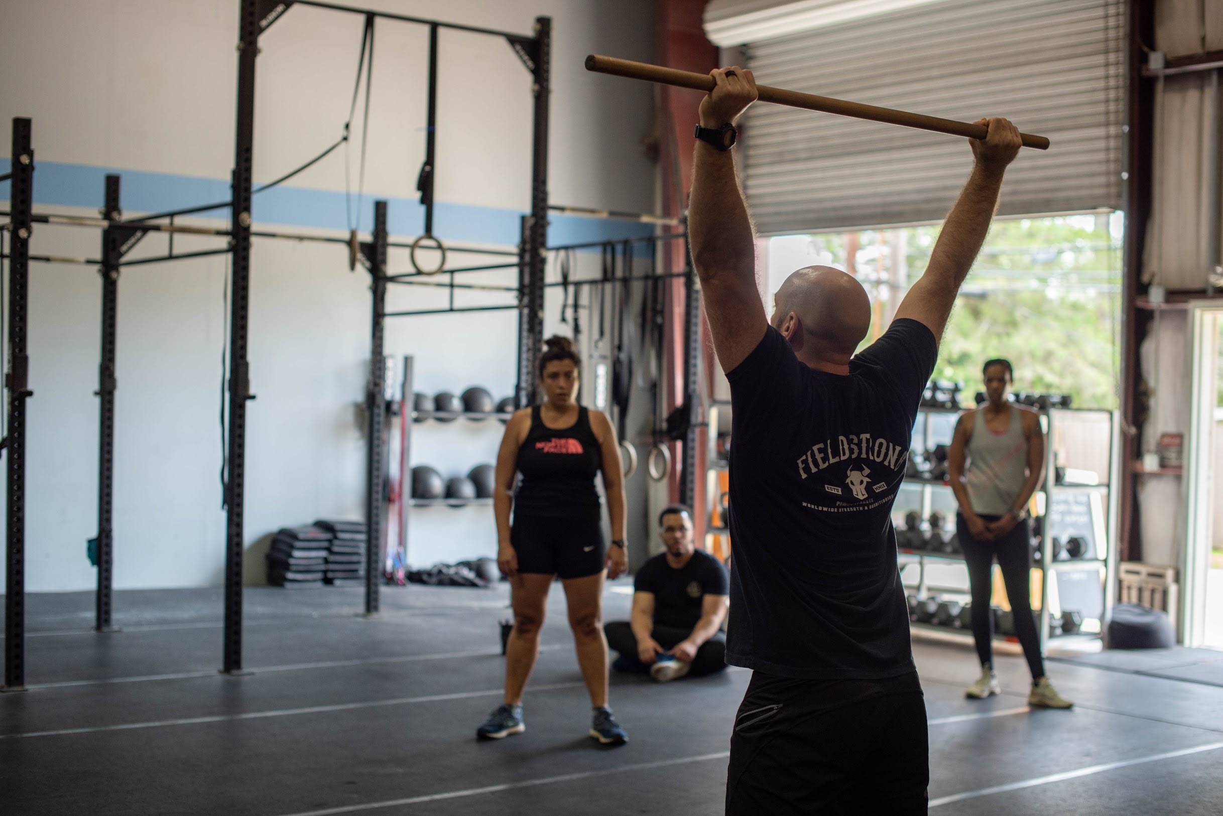
- A photo of real members who look like your ideal member. If you serve moms in their 40s, your hero image should not be a 22-year-old with an eight-pack mid-snatch. People need to see themselves in your gym before they'll walk into it.
- One clear button. Which brings me to...
2. Your CTA should be obvious, singular, and specific
CTA means call to action, aka the thing you want them to do next. And most gym sites have one of two problems:
- No CTA at all. You make them hunt for a tiny "Contact" link in the footer. Bold strategy.
- Seven CTAs. "Join Now," "Free Trial," "Download Our App," "Shop Merch," "Sign Up for Our Newsletter," "Follow Us," and "Book a Call" all compete for attention. When everything's a priority, nothing is.
Pick one primary action. For almost every gym, that's booking an intro, an eval, a free class, or a consultation. Make it the biggest, brightest button on the page, put it above the fold, and repeat it as people scroll. And make the button say what happens when they click it. "Book Your Free Intro" beats "Get Started," and "Get Started" beats "Submit."
Same gym, two first screens
What a prospect sees on their phone before they scroll.
Forge Gym
Could be a gym, a life coach, or a pre-workout brand. Seven buttons and no answers.
Small-group strength training for busy parents.
Coached 45-minute sessions for any starting point.
Book Your Free IntroWhat you do, who it’s for, and how to start, all before the first scroll.
3. No 15-page scavenger hunt
If someone has to click through Programs → Adult Programs → Strength → Schedule → Pricing → Contact to figure out how to start, you've built an escape room, not a website.
A few rules of thumb:
- Keep your nav short. Programs, Schedule, Pricing, About, and a "Book an Intro" button. That covers 95% of gyms.
- Every page should have a path to your CTA. Nobody should ever hit a dead end.
- Kill the PDFs. Nobody's downloading your schedule PDF on their phone. Put the schedule on the page.
- Test it on your own phone. Seriously, today. Pretend you've never heard of your gym and see how long it takes to book something. If it's more than three taps, fix it.
A quick aside about publicly listing your prices
I'm not going to tell you that you have to put your prices on your website. There are reasonable arguments on both sides, especially if you're selling high-touch coaching where the consult really does matter.
But I will tell you what you need to stop doing immediately: the pricing bait-and-switch.
You know the one. There's a "Pricing" link right there in the nav. The prospect clicks it, because they want to know the price. And instead of a number, they get a pop-up: "Enter your email and we'll send you our pricing!"
Come on.
Ten years ago, maybe that worked. People handed over their email, you got a lead, everybody moved on. But your prospects have now spent a decade getting farmed by every brand on the internet. They know exactly what happens after they type in that email: they get a 14-part drip sequence, a "just checking in!" text from a number they don't recognize, and maybe a call during dinner. They're not falling for it anymore. They're closing the tab and opening your competitor's site, the one that just answers the question.
And think about what that modal says about you. You put a link labeled "Pricing" in your navigation, which is a promise, and then you broke that promise to collect an email address. That's the very first interaction a prospect has with how you do business. It's not a great look for a business that's going to ask them to trust you with their health.
Here's the thing most gyms miss: nobody buys a membership off your pricing page anyway. The pricing page isn't there to close the sale. Its job is to let the right people self-qualify and the wrong people self-select out before they eat up 45 minutes of your coaches' time. Hiding the number doesn't change what you cost. It just delays the moment someone finds out, and that's after you've spent time on them.
So pick one of these and commit:
What you can't do is dangle the word "Pricing" and then hold it hostage. If you want their contact info, earn it by offering something they actually want, like a free intro, an eval, or a class. An email address traded for a real thing is a lead. An email address extracted by a trap is a future unsubscribe.

Let prospects book their own intro
With member-booked appointments in TeamBuildr OS, prospects pick an intro, eval, or consult time right from your site. No back-and-forth, and no form that drops into a void.
What prospects see on your website
Your Social Media Pages
Your second most valuable piece of real estate is your social media. And honestly? For a lot of you, it's your first, because that's where most people find you before they ever type in your URL.
People shop on social media for everything: restaurants, contractors, dentists, and yes, gyms. When someone lands on your profile, they're not browsing for entertainment. They're quietly asking the same three questions from before: What do you do? Is it for people like me? How do I start?
Ask yourself three questions before every post
1. If my ideal member saw this post, would they see someone who looks like them?
If your ideal member is a 45-year-old dad who wants to play with his kids without his back going out, and your feed is wall-to-wall 25-year-olds hitting muscle-ups, you're talking to the wrong person. You might even be scaring off the right one. The single most persuasive thing on your feed is a real member who looks like your prospect, doing something your prospect can picture themselves doing.
2. Is there a CTA anywhere?
Not every post needs to be a hard sell. But if someone loves what they see, do they know what to do next? "Link in bio to book a free intro." "DM us 'START' and we'll set you up." Something. A great post with no next step is a free ad for whoever they find next.
3. Is my brand anywhere in the image?
Posts get screenshotted, shared, reposted, and shown on the feeds of people who've never heard of you. If your logo, your gym's name, or at least your recognizable space isn't in the frame, you just made great content for... nobody in particular. Get your name on the wall, on the shirts, on the graphic. Somewhere.
You are not a thought leader (yet)
Here's the hot-takiest take in this post: the goal of your business's social media is not to be a thought leader.
Try this gut check. If you asked 100 random people who live or work within five miles of your gym whether they know you exist, and fewer than 20 said yes, then save your thought-provoking posts for your journal. No marketing dorks to back me up this time, but this is a hill I’m willing to die on.
Your local awareness problem isn't going to be solved by a 10-slide carousel on your take on creatine gummies, GLP-1s, or seed oils. Those posts might get engagement from other coaches an
d your existing members (who already pay you), but they do very little for the person three blocks away who's never heard of you.
That person isn't coming to your page for your opinions. They might care about them eventually, once they're a member and they trust you. Right now they're looking for two things:
- Do I feel some kind of kinship with the people in these pictures?
- Can these people help me?
That's it. That's the whole job.
Your page should funnel, not just entertain
When a new person lands on your profile interested in what you offer, your goal is to get them off social and onto:
- Your website, which, after the first half of this post, now clearly tells them what you do, who it's for, and how to start, or
- (Bonus points) a dedicated landing page for a specific offer, like a 6-week challenge, a free intro week, or a back-to-school athlete program. One offer, one page, one button.
A profile that funnels
Your bio, link, and pinned posts should work like a tiny website.
@yourgym
[Your Gym] Strength
Strength coaching for busy adults in [Town]. 👇 Book a free intro.
yourgym.com/intro Who we serve
 Member story
 How to start
Bio
What you do, who it’s for, and how to start. Not a Marcus Aurelius quote.
Link
Your booking page or current offer. Not your homepage, and not an 11-button Linktree.
Pins
Who you serve, one member story, and how to get started.
Practically, that means:
- Your bio answers the three questions. "Strength coaching for busy adults in [Town]. 👇 Book a free intro." Not a quote from Marcus Aurelius.
- Your link in bio goes somewhere useful. That means your booking page or your current offer, not your homepage, and definitely not a Linktree with 11 buttons.
- Your pinned posts work like a mini website. Pin one post on who you serve, one member transformation or testimonial, and one on how to get started.
The Bottom Line
The basics are the basics for a reason: they work. The shiny new Facebook ad playbook that your favorite gym owner guru is hawking likely isn't your lowest hanging fruit. Or if you’re like me and you’re using your socials as a place to show off your philosophical prowess, we’re still losing the plot. None of this is about having the prettiest website or the most viral Reel. It's about owning the touch-points that matter and respecting the 15 seconds a stranger gives you.
Every time someone lands on your site or your profile, they're deciding whether you're worth more of their time. Make it easy for them to say yes:
- Tell them what you do. In plain words, above the fold.
- Show them people like them. Real members, not stock photos or the fittest person in the building.
- Give them one obvious next step. And when they take it, don't trap them in a pop-up.
Your gym is probably great. Your coaches are probably great. Your community is probably the best part of your business. It's a shame when a confusing homepage and a feed full of hot takes are hiding all of that.
Now go open your website on your phone. I'll wait.
Member stories, ready to post
StoryBuildr turns your members’ wins into on-brand posts that pass the checklist: real people your prospects relate to, your gym in the frame, and a clear next step.

What prospects see on your website

Part 1: What I Got Right (and Wrong) as a Gym Owner
How to Lose Your Best Coaches: A Field Guide for Gym Owners