Grace Stiles (coach.grace27) brings experience as a Strength & Conditioning Coach to her role as an Assistant Soccer Coach at Cedarville University. She also serves as the Head of Marketing at TeamBuildr.
We are now seeing wearable technology being used at all levels of sport – not just the pros. GPS data has revolutionized the way coaches, analysts, and players see the game, however, it can be difficult to understand and manage. In this blog, I will be discussing 3 features from TeamBuildr's GPS dashboard download that will help you make sense of your data and allow you to easily share it with sport coaches (to use the dashboard, you have to upload raw data from the GPS system that you use and then it will organize it in a visually appealing way).

1. Customizable Bar Graph
The first tool within the dashboard is a bar graph that allows you to pick from metrics that your GPS system measures. The wearable technology that I use with the women’s soccer team at Cedarville University is called Beyond Pulse. It lets us track things like total distance, workload, number of sprints, heart rate, top speed, and more.
With this bar graph, we are able to see 9 days of data in a row and the overall trend of that period. Below is sample data from our season last fall. The graph shows the team’s average workload each day from September 22nd to September 30th. It also displays the trend line for these workloads.
Identifying team trends is useful, however, looking at individual athlete data is even more important. Since workloads vary significantly from player to player, it is crucial to have an understanding of athlete tendencies and patterns. The GPS dashboard allows you to focus on data for individual athletes. Below you can see what 9 days (inseason) looks like for one of our starting midfielders compared to a player who plays the same position but does not get as much playing time.


Seeing this can help you and the sport coach identify who may need to participate in what activities at training. For example, you might have those who had a workload of 20 or less on a match day participate in a high-intensity activity the day after the match (MD+1), and those whose workloads were 20+ engage in some type of recovery activity.
Tracking the workload of every practice can also positively impact session planning for sport coaches in the future. By looking at data, they will have a better understanding of the intensity of each activity. Strength Coaches or Sport Scientists can recommend a workload for the team and individual athletes to hit each day based on the adaptation goal. The sport coaches will be able to associate specific drills and activities with given workloads in an attempt to hit the session goal. Below is an example of common soccer activities that our team participated in at some point during a training session.
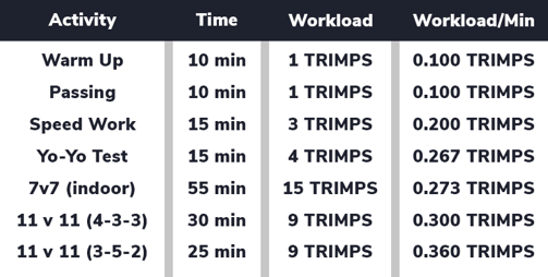
Obviously, every team's activity database will look different depending on what drills are practiced which is why I chose to show activities everyone would be familiar with.
2. Percent Change Chart
The next tool that the GPS dashboard offers is a percent change chart (see below). It will take data from a selected day and compare it to the previous day or the previous 7 days. The training session selected on 9/1/2023 was a low-intensity recovery session so you can understand why the percent change is so drastic compared to the average of the previous 7 days.

This tool is useful for tracking changes in intensity and load from session to session. This feature can be helpful when working with athletes who are recovering from an injury to ensure that their workload does not progress too quickly. It can also be used when athletes come back from winter break after taking time off to slowly get them back into the swing of things.
3. Position Group View
The workload in most sports varies from position to position and formation to formation. It is essential to create standards based on position as opposed to the overall average of the team. The charts below contain match day data (including the warm up) for 4 different athletes. The data for wingers are shown in the "7 or 11" position group and the data for attacking midfielders are shown in the "8 or 10" position group. The demands for these positions are quite different from one another. In this particular match, Athletes 1 and 2 played winger for 50-60 minutes of game time. Athletes 3 and 4 played in the midfield ranging from 69-76 minutes of game time.
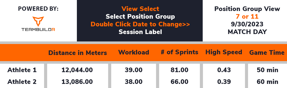
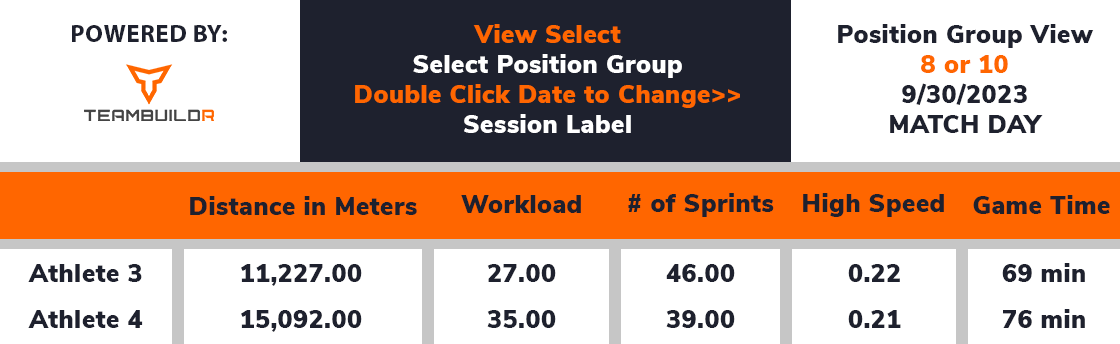
The key differences are the workload per minute (0.78 and 0.63 TRIMPS/minute for the wingers and 0.39 and 0.46 TRIMPS/minute for the midfielders), the number of sprints (81 and 66 for the wingers and 46 and 39 for the midfielders), and the percentage spent at high speed (0.43 and 0.39 for the wingers and 0.22 and 0.21 for the midfielders. These statistics can be useful when working with the sport coach to determine fitness testing standards or weekly workload goals. Identifying characteristics for each position can help you begin to create "profiles" for each position.
Collecting data is important, however, what you do with it is more important.


To the Excel Whisperer - An Inside Look At TeamBuildr Practice
Strength & Conditioning Podcast: Matt Nein and Mike Caro